10 AI Image Generators in 2026: What Each One Is Actually For
There is no best AI image generator, and every list that claims otherwise is comparing tools built for different jobs. Here is what each of the ten major ones is genuinely good at — plus what happened when I ran the same icon prompt through two of them.
I went looking for a straight answer to a simple question: which AI image generator should I use for my blog banners? Two hours later I had read eight comparison articles and they disagreed with each other on almost everything — which tool was best, which version was current, and in several cases what the free tier even was.
That disagreement turned out to be the actual answer.
These tools are no longer competing to be the best. They have split into specialisms, and the useful question is not which one wins but which one matches the job in front of you. A model that produces gorgeous concept art may be unable to spell a headline correctly. A model that renders perfect typography may be mediocre at cinematic lighting.
So here is a guide organised by job rather than by ranking — and at the end of it, a small test I ran myself that demonstrates the point better than any table.
A note on what this is, and isn’t
I have not run a controlled test of all ten tools. I have run one prompt through two of them properly, and I have written that up honestly further down. Everything else here is a researched map of what each tool is designed for, based on current documentation and comparisons — not my scores out of ten.
One more warning that applies to every article on this subject, including this one. Version numbers and free tiers in this category change monthly. While researching, I found reputable sources disagreeing about whether one major tool still has a free plan at all. Check the pricing page before you commit to anything. Treat any specific number you read anywhere, including here, as a starting point rather than a fact.
Start with the job, not the tool
Before picking anything, answer this: what happens to the image after it is generated?
- It goes straight onto a blog or social post — you want speed and ease, not control
- It has words in it — poster, thumbnail, banner — you need a typography specialist
- It becomes a logo or icon — you need vector output, not pixels
- It represents a product or a client — you need clean licensing more than beauty
- It is one of hundreds — you need an API, not a web interface
Those five answers point to five different tools. Almost every bad recommendation I read came from ignoring this step.
The conversational ones: ChatGPT and Gemini
Both OpenAI and Google now generate images directly inside their chat assistants, and for most people most of the time, this is the right starting point.
The advantage is not raw quality. It is that you can say “make the sky darker and move the text to the left” in plain English and it understands. No parameters, no seeds, no learning curve. If your images are illustrations for writing rather than the product itself, this is usually enough.
Google’s image model has been widely praised through 2026 for text rendering and multilingual layouts, and it is generally the more generous free option. OpenAI’s is often rated stronger for conversational editing and general production work.
Best for: bloggers, beginners, and anyone whose real job is writing rather than image-making.
The artistic one: Midjourney
Midjourney has spent three years being the tool that makes the most beautiful images, and that is still broadly true. It has a distinctive aesthetic signature — a look you can recognise across thousands of outputs.
That signature is a strength and a limitation. If you want concept art, moodboards, or something with real atmosphere, nothing else quite matches it. If you want a plain photograph of a product on a white background, you are fighting the tool’s instincts.
It is also weak at text inside images, and it no longer has a meaningful free tier.
Best for: artists, art directors, anyone whose output is judged on how it looks rather than what it says.
The typography specialist: Ideogram
Ideogram built its whole reputation on one thing: putting readable words inside a generated image. For years this was the hardest problem in the field, and Ideogram solved it earlier and better than most.
If you make YouTube thumbnails, posters, quote graphics, or anything where a headline sits inside the picture, this is the obvious tool. In 2026 it also released an open-weight version, which means you can run it yourself if you have the hardware.
The free tier exists but is tight, and free generations sit in a slow queue.
Best for: thumbnails, posters, social graphics — anything with words in the image.
The designer’s one: Recraft
Recraft does something the others mostly do not: it outputs true vectors. Not a picture of a logo, but an actual SVG you can scale to a billboard without it falling apart.
It also holds a brand style consistently across a set of images, which matters enormously if you are producing twenty assets that need to look like they came from the same place. Its text rendering is usually rated just behind Ideogram’s.
It is not the tool for photorealistic scenes. That is not what it is for.
Best for: logos, icons, brand systems, anything that needs to scale.
The legally careful one: Adobe Firefly
Firefly’s selling point has never been that it makes the best images. It is that Adobe trained it on licensed and public-domain material, and offers indemnification on commercial use.
If you are producing work for a client, or anything that goes near a legal department, that distinction is worth more than a few points of image quality. It also lives inside Photoshop, which matters if that is where you already work.
Firefly’s free offering is the one I found the most contradictory reporting about during research. Check it directly.
Best for: client work, commercial projects, anyone who needs to answer “where did this image come from?”
The developer’s one: FLUX
FLUX, from Black Forest Labs, is where you go when you want photorealism at volume and through an API rather than a web page.
Its open-weight versions can be run on your own hardware, which means no per-image cost, no content filter you did not choose, and no risk of the terms changing under you. That last point is not trivial — every hosted tool on this list can alter its pricing tomorrow.
The tradeoff is setup. This is a tool for people comfortable with technical work.
Best for: developers, automated pipelines, high-volume product imagery.
The volume one: Leonardo AI
Leonardo has consistently offered one of the most generous free tiers in the category — daily credits rather than a small monthly allowance — along with model choice, style references, and a usable canvas editor.
It is a good place to learn, because you can afford to fail repeatedly without paying for it.
One catch worth knowing: on the free plan, generations are typically public, and the terms around ownership are less favourable than paid tiers. Read them before using free output commercially.
Best for: learning, experimenting, stylised and character work.
The ones already in your workflow: Canva AI and Playground
Canva’s image generation is not the best available and does not need to be. Its advantage is that the image appears inside the design you are already building. If your end product is a social graphic or a slide rather than an image, that saves more time than better raw quality would.
Playground sits in a similar space — a straightforward web editor with reasonable free volume, aimed at people who want to make something quickly without learning a new craft.
Best for: people whose final output is a design, not an image.
What one real test showed
Rather than score all ten, I ran a single prompt through two of them and looked at the results properly. Here is the prompt:
App icon for a note-taking app called “Ledger”. Flat vector style, single rounded square, warm off-white background, one dark ink line drawing of an open notebook, small orange accent mark. Minimal, no gradients, no shadows.
Both produced something usable at full size. At 1024 pixels, honestly, either would pass.
Then I shrank them to the sizes an app icon actually gets used at.
The 48-pixel test
This is the test that matters and almost nobody runs it. An icon lives at 48 or 64 pixels on a real screen, not at 1024 in a generator’s preview window.
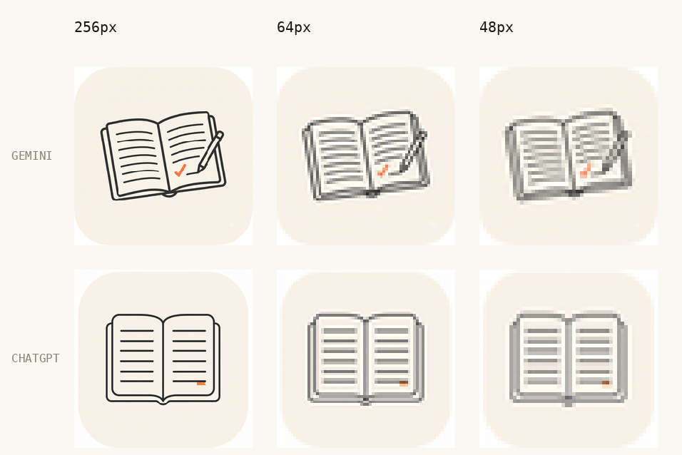
Gemini’s version had charm — a slightly sketchy, hand-drawn quality, with a pencil resting across the page. At 48 pixels it collapsed into a grey smudge with an orange speck. The uneven line weight and eight tightly-spaced ruled lines merged into mush.
ChatGPT’s version was plainer and more disciplined: uniform stroke weight throughout, six ruled lines instead of eight, wider spacing, and a solid orange bookmark instead of a thin checkmark. At 48 pixels it was still legible as a notebook.
The prettier image at full size was the worse icon at real size.
Three things this taught me
Uniform stroke weight beats everything. It is the single largest factor in whether an icon survives being shrunk. A model that draws with varied, expressive lines will lose to one that draws boringly and consistently.
Models add things you did not ask for. My prompt said one drawing of a notebook. Gemini added a pencil and a small decorative sparkle. Neither was wrong exactly, but “minimal” is an instruction most models treat as a suggestion. Say what to leave out as explicitly as what to put in.
Neither gave me a vector. Both returned raster images. For a real app icon I would still have to redraw it by hand in a design tool. That single limitation is the entire reason Recraft exists, and it is the clearest illustration I can give of why “which is best” is the wrong question.
Two tools, one prompt, twenty minutes. It told me more about the real differences than the eight comparison articles I read beforehand.
The workflow that actually works
Whichever tool you pick, the process is the same, and most people skip the third step:
- Describe the job, not the picture. “Banner for an article about AI privacy” gets you further than “cool tech image”
- Write a specific prompt. Subject, setting, lighting, mood, framing. Vague prompts waste credits
- Generate several, then vary the best one. Most tools have a variations feature that is cheaper than starting over. Almost nobody uses it properly
- Refine in words. “Same image, darker background, more space at the top for a headline”
- Test it at final size. Shrink it to how it will actually be seen. This is the step I had been skipping
A prompt to try
Paste this into whichever tool you are testing. It is deliberately specific, and comparing the outputs tells you more about the differences between these tools than any comparison table will:
A wide editorial banner: a wooden desk seen from above, an open notebook with handwritten diagrams, a cup of coffee, warm late-afternoon light from the left, muted paper tones, generous empty space on the right for a headline, shallow depth of field, photographic, no text.
Note the last two instructions. “Generous empty space on the right” gives you somewhere to put a title. “No text” stops the model inventing garbled words. Both are habits worth keeping.
Common questions
Which is the best free one? For general use, the free tiers inside Google’s and OpenAI’s assistants are the easiest starting point. For volume, Leonardo. For text in images, Ideogram. Free tiers change constantly, so verify before relying on any of them.
Can I use these images commercially? Usually on paid plans, often not on free ones, and the details vary by tool. Adobe Firefly is the clearest on this point. If the image is for a client, read the licence rather than assuming.
Can they spell yet? Much better than a year ago. Not reliably enough to publish without checking. Proofread every generated word.
Can they make app icons? They can make pictures of app icons. Neither of the two I tested produced a vector file, so for production work you are using the output as a reference and redrawing it. Recraft is the exception worth trying if this is your use case.
Do I need more than one? If you make images occasionally, no. Pick one and learn it properly. If images are part of your work, two is a sensible number: one general-purpose, one specialist for whatever you make most.
What I would actually do
If you are starting from nothing: use the image generation already built into whichever AI assistant you use. It costs nothing extra, there is nothing to learn, and it will handle most of what a blog or small business needs.
Move on only when you hit a wall you can name. “The text keeps coming out wrong” means Ideogram. “I need this as a logo” means Recraft. “This is for a client” means Firefly. “I need four hundred of these” means FLUX.
The wall tells you which tool to try next. Chasing the top of a ranking list will not.
Related reading
